Good morning, one and all. Did I mention that this column now has its very own newsletter? If you’re liking what you read, sign up here, and it’ll keep landing in your inbox every week. Otherwise, I’ll stop popping up in your emails soon enough.
A Crack-Up at Cracker Barrel
When the news is slow, like in the dog days of summer, deranged denizens online can be relied upon to fixate on random decisions made in random corporate boardrooms, and to lose their minds over how it shows that their enemy in the culture war is winning. A few weeks ago, it was Sydney Sweeney’s jeans, which were somehow a symbol of white supremacy. Two years ago, there were convulsions on the right over how Bud Light had abandoned its macho roots and gone trans when it sent a personalized can of beer to Dylan Mulvaney, a trans influencer. And now, Cracker Barrel has gone woke, too!
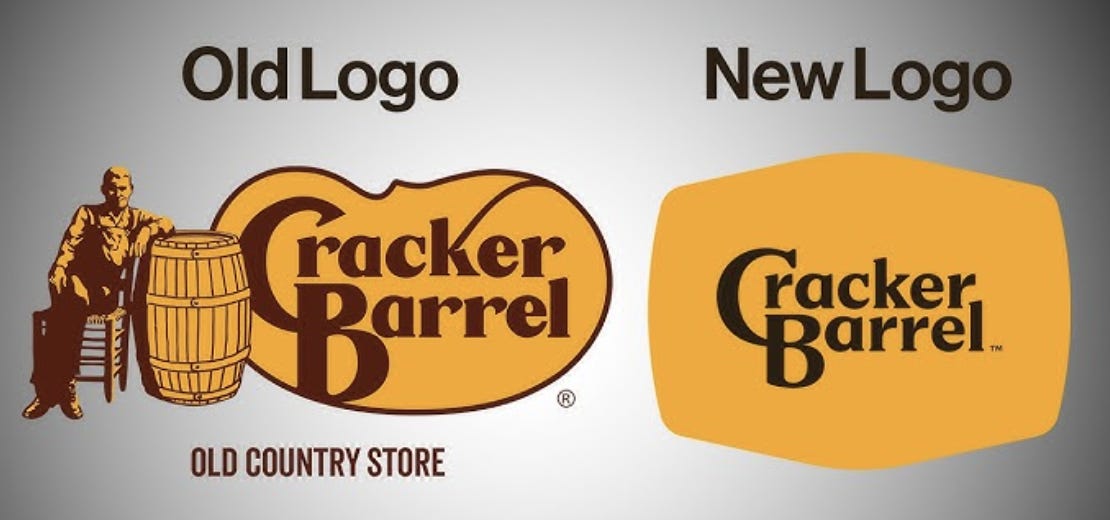
Basically, the chain restaurant has abandoned as its logo the drawing of an old man sitting on a wooden chair and leaning against a barrel, which all Americans will recognize from the massive signs on the highway. Cracker Barrel has opted instead for a pared-down black and yellow stamp with fewer flourishes. Compare:

This may look like a misguided attempt to fit in with the hyperclean simple look that’s been adopted by brands like Burger King and Jaguar, to more or less indignation. But with Cracker Barrel, it went further. People claimed that the new logo was a disappointment to “the entire country,” and that the company’s CEO, Julie Felss Masino, “radiates out-of-touch liberal elitism.” A Florida congressman who said he worked for Cracker Barrel in Tallahassee during college blasted the new logo as a “woke rebrand” and added that he “gave his life to Christ in their parking lot.” Even Steak ‘n Shake piled on, writing on X, “We will never market ourselves away from our past in a cheap effort to gain the approval of trend seekers.” That’s some big talk for a milkshake joint.
In 2021, a rumor spread online that the flourish extending from the “k” in Cracker was actually a slave whip, and that the barrel itself was used to store whips.
Critics pointed to the fact that stripping away “Old-Timer”—the guy leaning on the barrel—amounted to Southern erasure. The new restaurants have fewer rocking chairs—it was less quaint, more “gentrified.” For its part, the chain said that the new logo is “now rooted even more closely to the iconic barrel shape.”
Click this link for the original source of this article.
Author: Suzy Weiss
This content is courtesy of, and owned and copyrighted by, https://bariweiss.substack.com feed and its author. This content is made available by use of the public RSS feed offered by the host site and is used for educational purposes only. If you are the author or represent the host site and would like this content removed now and in the future, please contact USSANews.com using the email address in the Contact page found in the website menu.


