The fight over Minnesota’s new state flag isn’t letting up. From rural counties refusing to fly it, to nearly 40,000 people signing a petition demanding the old banner’s return, the debate has become one of the state’s most contentious political flashpoints.
Alpha News reached out to the man behind the design, Andrew Prekker of Luverne, who responded after our initial article was published last week and answered our questions directly.
We also went to the Minnesota State Fair to hear how everyday Minnesotans feel about the change.
Prekker defends his flag design
Prekker insists his creation was never meant to divide.
“From the moment I started designing concepts for a new state flag, I always envisioned a symbol of unity for all people that reside in Minnesota,” he told Alpha News. “The flag is about bringing people together, representing our state, acknowledging the state’s history, and expressing the experiences we all have in common.”
On the backlash, he says communication is key.
“My first response to anyone who says they dislike the new flag is to share what it represents,” Prekker said. “I’ve seen a lot of opinions change when they understand the symbolism behind it.”
Critics say the new design resembles the Somali flag, but Prekker brushed the comparison aside, saying it “started as a conspiracy theory.”
” … In the world of flag design, the two flags are completely different,” Prekker said. “The only thing they share in common is the color blue (different shades) and a white star (different number of points), which if those are the only parameters to make a flag look ‘Somali,’ then the U.S. flag also looks like a Somali flag,” he said.
He said he never looked at other countries’ flags when creating his design, but did look to other states for inspiration.
“If you stand in the rotunda of the Minnesota State Capitol, beneath your feet will be a giant equal-8-pointed star built right into the floor. That is a North Star, and that is the star that’s on the flag,” Prekker said.
And while his social media shows strong left-leaning views, Prekker rejected the idea that those opinions shaped his design. He said he took seriously his obligation to create a design that “must not represent a single community,” and noted that public input guided the redesign commission’s process “every step of the way.”
“Politics had nothing to do with designing the flag, and I find it deeply insulting when people suggest otherwise,” he said. “This is a Minnesotan flag designed by and for Minnesotans, regardless of political background.”
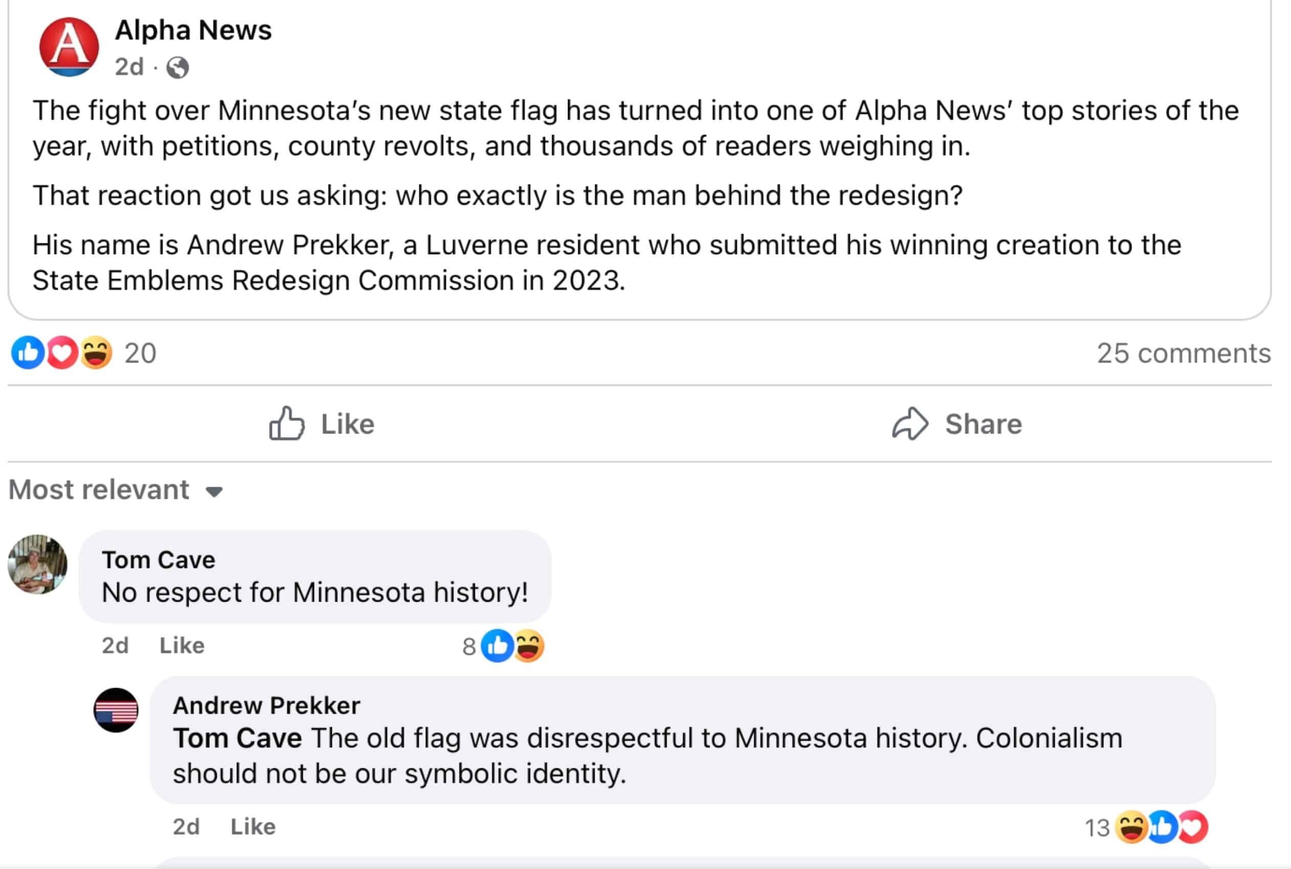
For his part, Prekker shared the Alpha News story on his Facebook page. In one comment, he defended his design, writing: “The old flag was disrespectful to Minnesota history. Colonialism should not be our symbolic identity.”

Minnesotans sound off at the fair
At the State Fair, opinions flew faster than cheese curds from a deep fryer.
“I absolutely despise it,” one fairgoer told Alpha News. “The old flag showed everything that Minnesota was. How can that be racist?”
Another chimed in: “Absolutely not! It’s beautiful. It showed off what Minnesota is really about.”
Some were more blunt. “Absolutely not,” said one man when asked if he liked the new flag. “It’s a little more boring,” added another.
Others shrugged. “I literally never even look at the flag. It doesn’t bother me, so I don’t really care that we changed it,” one woman admitted.
Still, a few defended the redesign. “I do like the new flag,” a supporter said. “The old flag really didn’t represent Native Americans properly — it made it seem like they were riding off into the sunset.”
The “Somali flag” comparison came up repeatedly.
“It reminds me of the Somali flag,” one man said. Another went further, calling Somalia a “small little country that’s trying to take over our metro area.” Others insisted the resemblance was obvious: “It looks more like a Somalian flag. It does not represent Minnesota whatsoever.”
Several Minnesotans said the whole matter should have been put to a vote. “I think it should have been brought to an election instead of being forced down our throat,” one fairgoer said.
Petition grows
Meanwhile, a petition to restore the old design has surged to nearly 40,000 signatures. Its organizer, who goes by “Minnesota Lady America First” online, has been circulating reminders of the old flag’s detailed symbolism, urging residents to “share this with other proud Minnesotans.”
Gov. Tim Walz has defended the redesign, calling the old flag “highly offensive to a large number of people.” Some flag experts have praised the new banner, with one giving it an A+.
But if the State Fair is any indicator, the divide isn’t going away anytime soon.
The post Fair game: Minnesota fairgoers dish on new flag as designer defends it appeared first on Alpha News MN.
Click this link for the original source of this article.
Author: Jenna Gloeb
This content is courtesy of, and owned and copyrighted by, http://alphanewsmn.com and its author. This content is made available by use of the public RSS feed offered by the host site and is used for educational purposes only. If you are the author or represent the host site and would like this content removed now and in the future, please contact USSANews.com using the email address in the Contact page found in the website menu. Follow Jonah on Twitter at @JTorgerud.


