Same Excess Death Patterns in Multiple Data Sets after mRNA Vaccine Rollouts
by Debbie Lerman at Brownstone Institute
This article is based on the painstaking and meticulous work of intrepid researcher and Substack writer csofand. I will refer to him as “the researcher,” as he prefers to remain anonymous.
I am also grateful for the assistance of citizen researcher/journalist Benjamin Marten, who generously shared his VAERS data queries and results with me.

Why am I writing about excess mortality associated with Covid mRNA vaccines?
Recently, I was talking to some friends about various Covid topics and casually mentioned deaths and disabilities associated with the mRNA vaccines, as documented by the company that made them. My friends, who are somewhat open to Covid skepticism but have not explored the subject very thoroughly, and are still ensconced in the corporate media bubble, were taken aback. “You mean people died from the vaccines?” they asked incredulously.
Which, for me, raised the question: How can we still be arguing about this?

I hope the information compiled here can help put an end to the question of whether or not Covid mRNA vaccines harm and kill people.
What Is “Excess Mortality”?
According to Wikipedia, excess mortality is an epidemiological term that means “the increase in the number of deaths during a time period and/or in a certain group, as compared to the expected value or statistical trend during a reference period (typically of five years) or in a reference population.”
Simply put, it means more deaths than expected based on previous trends and future projections. As it relates to Covid-19, starting very early in 2020, a major topic of concern became how much excess mortality was caused by the disease (whether or not the disease actually caused a lot of excess mortality is a separate issue). After 2020, with near universal exposure to the novel coronavirus, and the rollout of a global vaccination campaign, excess mortality was expected to go back down. Instead, it increased.
The Three-Spike Pattern
In this article, I will not attempt to quantify excess mortality in the years since Covid, nor will I establish a one-to-one correlation between Covid vaccinations and deaths.
Others, including most prominently Ed Dowd and Dennis Rancourt et al, have done extensive work on this topic, which I encourage readers to explore.

My purpose is to provide information that supports and corroborates these researchers’ conclusions, showing that in a variety of disparate databases, an almost identical pattern of excess deaths appears every time – which I will refer to as the three-spike pattern. The same pattern appears in death reports in VAERS (the Vaccine Adverse Events Reporting System of the CDC) and in overall mortality trends both nationally and in individual states.
Specifically, the three-spike pattern appears in every data set around these periods:
December 2020-January 2021
August-September 2021
January-February 2022.
My contention in this article is that the mRNA vaccine rollouts/approvals are the singular events that correspond exactly with the three-spike pattern in all of these datasets:
December 11, 2020: Pfizer/BioNTech Emergency Use Authorization
December 18, 2020: Moderna Emergency Use Authorization
August 23, 2021: Pfizer “full FDA approval”
January 31, 2022: Moderna “full FDA approval”
If anyone can find another explanation for the three-spike pattern correlations in all of the graphs and data presented here, please contact me with the information and/or add to the comments section.
Three-Spike Post-2020 Excess Mortality Shocks Life Insurance Experts
In May 2024, life insurance experts affiliated with the nonprofit Insurance Collaboration to Save Lives got together to discuss trends in the life insurance industry – specifically, the surprising rise in excess mortality rates after 2020. The conversation began with a statement about how unusual it was to even be talking about “excess mortality”:
When people start talking about excess mortality, and that’s not something you ever hear in life insurance companies, not ever in my entire career as an insurance analyst, not something we ever talk about…
The implication here is that the life insurance industry does a good job of projecting death rates, because that’s what their entire business model depends on. So talking about “excess mortality” – which means unanticipated deaths – almost never happens.
This was followed by an acknowledgement of the unprecedented trend of excess mortality after Covid:
In past pandemics, you see a pull forward of mortality, and then you see a valley for the mortality that was pulled forward. That usually is the next year. We’re four years on, and we haven’t seen any kind of a valley, and when you see an average of a 6%, a 12% increase, there are some age groups that were still 20% last year, still 20% up.
In other words, based on previous mortality trends after disease outbreaks, we would expect an increase in mortality above the projected level the first year, and then a decrease back to pre-outbreak projections, or even below them, after that. But with Covid this has not happened.
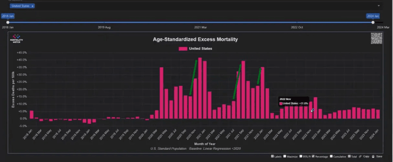
Detailing the unprecedented elevated excess mortality following the 2020 Covid emergency, a participant presented this analysis of the age-standardized excess mortality for the United States:
Look at these numbers for two years. There is excess above the baseline, These were periods when we were seeing deaths that were higher than we expected. This is monthly data. In December 2020, it was 41% higher than it was supposed to be. September 2021 was a weird month for that, as it was 39% higher than it was supposed to be. But luckily in 2022, it declined. But you’re still in this 10%, 12%, 11%, 14% in December 2022. These are big numbers, these are very stable. Recently, in 2023, it’s been more like 6%. The data’s not mature yet for the more recent months, but in January 2024, so far it’s 6.2%.
The participants go on to speculate about what could be causing the prolonged excess death rates. They do not come up with a satisfactory answer.
They also do not ask a crucial and obvious question: What might have happened in December 2020/January 2021 that could cause such a shockingly unexpected bump in deaths, a whole year after the novel coronavirus started circulating? And what happened in or around September 2021 and January 2022 when the other biggest death spikes occurred, that might be correlated?
The mRNA vaccine rollouts are an obvious potential explanation, which everyone seems to willfully ignore.
Three-Spike Pattern in Obituary Database
HeritageHub is an obituary database that “provides access to hundreds of years of obituaries and death notices from thousands of newspapers and funeral homes throughout the United States.” It is paywalled and available through public libraries and other institutional subscriptions.
The researcher made this graph showing the number of obituaries in the database recorded for each month since January 2016. Here’s what it looks like:
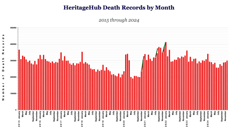
The three-spike pattern is clear: after March 2020, the biggest month-over-month spikes are in January 2021, September 2021, and January 2022.
Interestingly, After the big March-April 2020 spike (which nonetheless does not exceed previous peaks), corresponding to the beginning of the declared pandemic emergency in the United States, there is a big dip that goes lower than any other dip in obituaries since 2015. How could this be, when we were only a few months into the emergency at that point?
One explanation tracks with the life insurance experts’ point that after a surge in deaths, when the most vulnerable population dies in large numbers (which could be caused by multiple factors), we expect to see a “valley” because the population of vulnerable people has significantly decreased. Indeed, we see that the valley continues all the way until the introduction of the first mRNA vaccines in December 2020.
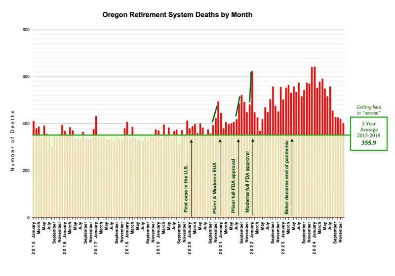
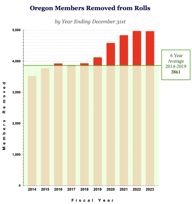
Three-Spike Pattern in Oregon State Retiree Death Data
The researcher also looked at every state’s Employee Retirement Benefits report (discussed in more detail below). For most states, he relied on published reports showing the number of retirees removed annually from benefits rolls in the state’s retirement system, which reflects the number of retirees who died.
For Oregon, the researcher asked the state for more granular data, reflecting the number of retirees removed from the rolls monthly instead of yearly.
This is the graph showing the monthly number of deaths of Oregon state retirees January 2014-December 2024. The graph includes a line indicating the average number of deaths in the period before Covid (2014-2019) and shows how many deaths above that average occurred.
The green arrows indicate the three-spike pattern. Interestingly, an additional big spike occurred between September 2023 and January 2024. On September 11, 2023 the FDA “approved and authorized for emergency use” updated mRNA Covid vaccines.
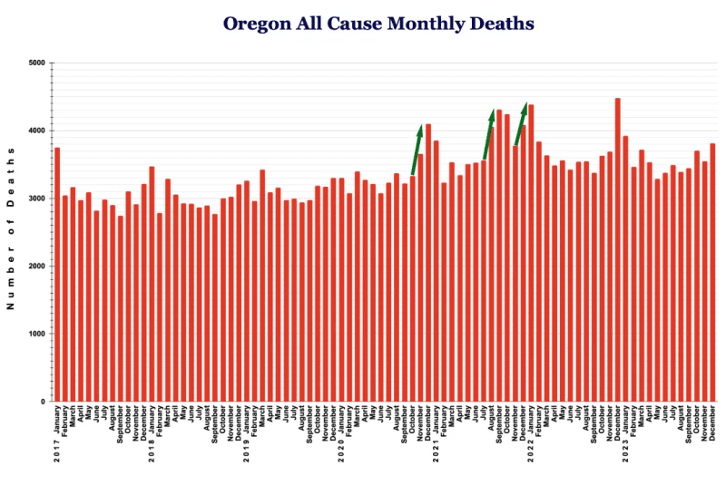
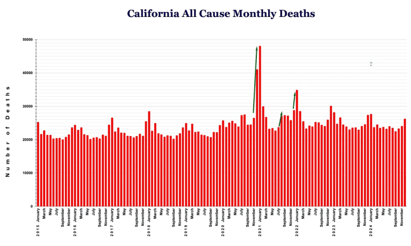
Three-Spike Pattern in Oregon & California All-Cause Mortality Data
The researcher proceeded to chart overall mortality data in Oregon, and in other states for which data was available. Included here are the graphs for Oregon and California, showing the very clear 3-spike pattern. (Additional states are available on the researcher’s Substack).
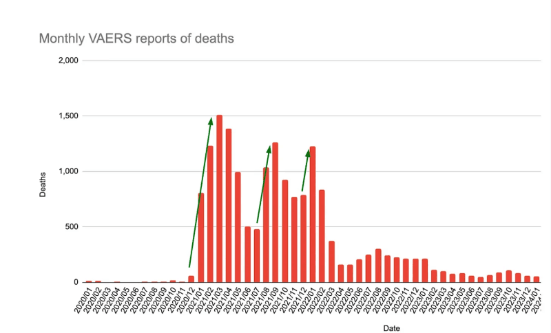
Three-Spike Pattern in VAERS Death Reports
This graph was provided to me by independent researcher Ben Marten, based on his queries to the CDC’s Vaccine Adverse Events Reporting System for deaths reported between 2020 and 2024.
(The full data set is available upon request.)
As in every other data set we have examined, the biggest month-over-month spikes occurred between December 2020 – January/February 2021 (from 57 to 803 to 1231), July and August 2021 (from 482 to 1,084) and December 2021 – January 2022 (from 788 to 1,225).
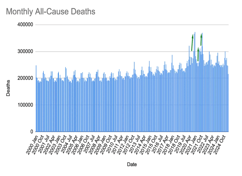
Three-Spike Pattern in All-Cause Mortality in CDC Data
Marten also provided this graph of monthly all-cause mortality, as reported by the CDC. Once again, the biggest month-over-month spikes occur at exactly the same points:
What can we say about the three-spike pattern?
The more different data sets we examine, the more we see the same pattern over and over: in the one-to-two-month period right after the rollouts/approvals of Pfizer and Modern mRNA vaccines, death rates spike above all previous (and in most cases subsequent) levels.
Yet in almost all discussions of post-Covid mortality and disability, the experts grasp at every explanation, except the mRNA vaccines. Maybe it’s obesity and diabetes, or depression and drug use, or motor vehicle accidents, or delayed cancer care exacerbated by the lockdowns. Maybe it’s a baby boomer death bubble suddenly materializing. Or everybody’s favorite: “long Covid.”
The unanswered (and I would argue unanswerable) question is why any of those causes would follow the three-spike pattern that corresponds exactly with the rollouts of the mRNA vaccines.
The Same 2021 & 2022 Spikes in Excess Deaths and Disabilities across Locations and Populations
Notably, some excess mortality discussions also try to claim that the spikes in excess deaths did not occur uniformly across all age groups and geographic areas, thus presumably excluding the mRNA vaccine rollouts as an explanation. For example, one March 2022 article on excess mortality claims that “Surges in excess deaths varied in timing and duration across states,” implying that different issues were causing excess deaths in different places.
As we will see in this section, an analysis of very similar population segments (state retirees), across dozens of states, belies the “varied surges” notion, as does data on both deaths in young people and disabilities in the U.S. working population.
The Same Excess Death Trends Revealed across Dozens of State Retiree Databases
In addition to the Oregon state retiree data presented above, the researcher analyzed data from the annual financial reports of the Employee Retirement Systems in all 50 states in the U.S. The researcher focused on these reports, because they reflect state finances and fiscal liabilities, and do not address death rates directly. Thus, the death counts included in the reports may be less prone to manipulation or obfuscation.
These reports also reflect a slice of the population that other researchers may not have focused on: state retirees. This is an older population that is not in the workforce anymore. The retirement age for most state employees across the country begins at 50 and goes through 65. It is noteworthy that the excess death trends in this population mirror almost identically the findings in so many other data sets.
But first, to understand the researcher’s work on retiree benefits reports, it’s important to understand the data he analyzed.
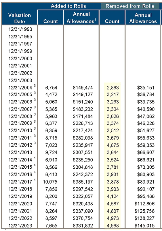
What are Employee Retirement System financial reports?
Each state’s retiree annual report provides accounting and actuarial information pertaining to the expenses, investments, assets, and liabilities of the system that manages retirement and death benefits for that state’s employees. These reports are compiled separately by each state and encompass state employees across many areas including administration, education, transportation, law enforcement, and more. The number of people in each state’s retirement system ranges from approx. 40,000 to 2.3 million (corresponding to the overall population of each state).
Buried in the actuarial sections of these reports are tables that show how many retirees and beneficiaries were removed from the retirement benefits rolls each year, which means that they stopped receiving benefits. According to spokespeople in multiple states contacted by the researcher, when someone is removed from the rolls, it almost always (>90% of the time) means that the person died. Thus, the number of retirees removed from state benefit rolls is a good indicator of the number of deaths in the state retiree population.
This sample chart shows “number removed from retiree benefit rolls” in the Oregon State Employee Retirement Report (p. 147)
When this data is presented as a bar graph, with a line denoting the 6-year pre-Covid average, we can see the excess deaths rising in 2020, reaching a peak in 2022, and barely declining in 2023.
The researcher made similar graphs for every retiree benefits system in the U.S. All the data, with links to all the reports, is available on his Substack.
The researcher also aggregated data from 23 states (see list below graph) to show the overall excess mortality trends.
(NOTE: He chose these 23 states because they all used the same reporting metrics. Other states differed in the calendar periods they used and the groups of state employees they included in their calculations.)
In this chart, the biggest surge in excess deaths occurs between July 2020 and July 2021 – the period that includes the first spike in the three-spike pattern. The excess mortality does not decline at all in the July 2021-July 2022 period, which includes the second and third spikes. And it remains significantly elevated in the following year.
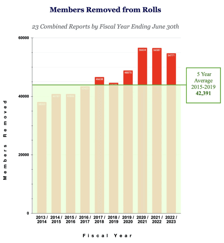
Although the goal here is not to calculate the number of excess deaths, it is worth noting that in every year after June 2020, there were over 10,000 excess deaths in this population. Very crudely calculated, that means that over 30,000 excess deaths occurred in a relatively small population (the retirees in 23 states) in the three years following the mRNA vaccine rollout.
Parallel Pattern in Young Population
Tens of thousands of deaths also occurred in younger populations after the rollouts of the mRNA vaccines, with the same 3-spike pattern. As Ed Dowd noted in his examination of excess deaths among young people:
Between March of 2021 and February of 2022, 61,000 millennials died excessively above the prior 5 year base trend line.
More millennials died in 2021 than American soldiers were killed in the Vietnam War.
The relative timespan and rate of change into the fall of 2021 is a signal that a harmful event occurred to this 25-44 age group.
Here’s Ed Dowd’s graph, with the three-spike pattern:
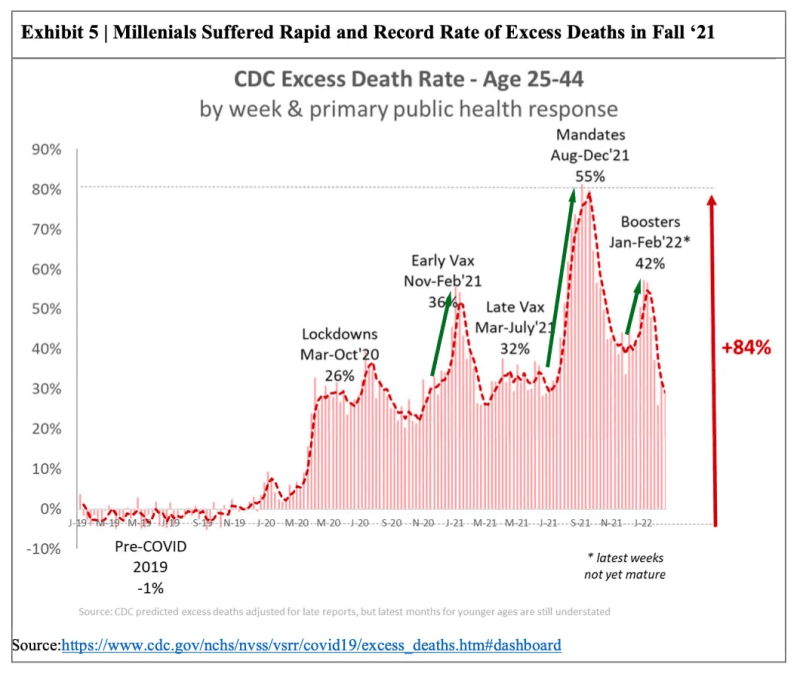
Even if only a portion of these deaths is attributable to the mRNA vaccines, that’s tens of thousands just in the United States.
And the numbers have never returned to the expected baseline.
A “New Normal” Following 2021-2022 Excess Death Spikes
As illustrated in the researcher’s combined state retiree chart above, excess mortality spiked in 2021, remained high in 2022, and did not return to anything close to normal in 2023. Additional reports show a continuation of elevated excess mortality in 2024 (see csofand.substack.com).
This is the same trend discussed by the life insurance experts at the beginning of this article. In their analysis, they puzzled over the fact that the death rates after 2020 never returned to the expected baseline. “I’d say we’re living in the new normal now,” one of them said, based on the fact that even in January 2024 mortality was still about 6% above expected rates.
Where is all the extra death coming from?
The life insurance experts proposed an interesting explanation for continued excess deaths in 2023-2024: a steep increase in the number of disabilities in the population, way above pre-2021 rates, potentially resulting in a “new normal” mortality baseline.
This graph, based on data from the U.S. Bureau of Labor Statistics, shows disabilities in the U.S. workforce skyrocketing after January 2021 and continuing to climb to alarmingly high rates without any sign of decline ever since.
The disabilities may not correspond to the excess deaths – which are likely also associated with the ongoing millions of mRNA Covid vaccines still administered in the U.S. But the huge spike beginning in January 2021 (as in every other data base we’ve examined) corresponds to the rollout of the mRNA vaccines.
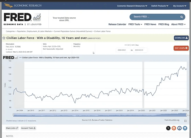
According to one of the life insurance experts, this chart shows that disability in the population of people who are working or trying to work in the U.S. was “38% higher” than pre-Covid at the beginning of 2024. “That’s nuts,” he admits.
Could this all be attributed to “long Covid” or lockdown-related lapses in care and increases in chronic illnesses? Does this graph reflect the trends repeatedly (and I would argue intentionally) emphasized by MAHA leaders, including our nominated Surgeon General, that “We live in a toxic stew” which supposedly explains why “in 2024, is the highest rates in American history of Alzheimer’s, cancer, autoimmune conditions, heart disease, diabetes, cancer, kidney disease, autism. Every single chronic disease you could think of…”?
If it’s a chronic toxic stew causing all these issues, why would they show such a giant, unprecedented spike between January 2021 and January 2022?
As demonstrated in this article, failing to address the mRNA vaccine factor is, to quote one life insurance expert, totally nuts.
Conclusion
There is no doubt that excess mortality rates in various populations surged in 2021 – above all predictions, even given the Covid-19 event of 2020.
This occurred on the population level and in sub-populations across diverse geographic regions.
A giant spike in disabilities also occurred in 2021.
The spikes in deaths and disabilities corresponded to the rollouts of the mRNA vaccines.
If there is a different cause that can explain these correlations, I have not found it.
Apparently, current HHS Secretary RFK Jr. agrees. Here’s what he said in December 2022 about Ed Dowd’s analysis of excess deaths in young people:
In this unusual book, “‘Cause Unknown’: The Epidemic of Sudden Deaths in 2021 and 2022,” Dowd proves an undeniable and urgent reality, laid out with facts that can be confirmed by any reader, point by point, page by page.
He has helped us all understand something that many powerful people want to deny — and would get away with denying were it not for his skills and integrity.
Secretary Kennedy claims here that he understands that many thousands of excess deaths in young people happened in 2021 and 2022 due to the mRNA Covid vaccines.
I support Kennedy’s decision to stop funding mRNA vaccine development through BARDA. Yet the question remains: How can Kennedy, or anyone for that matter, justify the study, authorization, or administration of any mRNA vaccines ever, in any population, based on this understanding?
Republished from the author’s Substack
Same Excess Death Patterns in Multiple Data Sets after mRNA Vaccine Rollouts
by Debbie Lerman at Brownstone Institute – Daily Economics, Policy, Public Health, Society
Author: Debbie Lerman
This content is courtesy of, and owned and copyrighted by, https://brownstone.org and its author. This content is made available by use of the public RSS feed offered by the host site and is used for educational purposes only. If you are the author or represent the host site and would like this content removed now and in the future, please contact USSANews.com using the email address in the Contact page found in the website menu.