Executive summary
The claim that the COVID vaccines are perfectly safe is easily falsified by looking at any time series plot.
A safe vaccine has a relatively flat time series (it may have bumps for seasonality if the vaccine is given over a narrow time window).
An unsafe vaccine has a time series where the deaths per day increase from baseline.

So it’s obvious from the time series data what is going on.
But did you know that none of the papers in the peer reviewed scientific literature will show you a time series plot for the COVID vaccine? I couldn’t find a single one!
And when Andrew Bridgen (along with 6 other MPs) sent a letter asking Professor Sir Ian Diamond the CEO of the UK ONS for the time series data, they told him to pound sand.
But this is what a time series for a safe vaccine is “supposed” to look like. A flat line.

Here’s another vaccine. See? Same flat line.

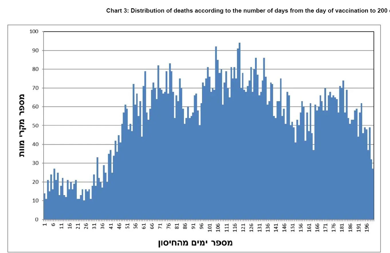
Time series plots for COVID vaccines from Czech Republic: not a flat line!
The increase in mortality in just 200 days is mind blowing: 20%, 58%, and 39% for dose 1, 2, and 3. This is for all ages.
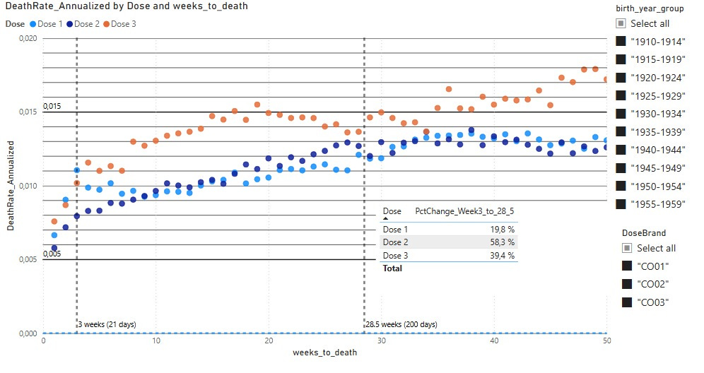
Here’s a close up of the HVE effect which is easiest to see on Dose 1. Count the dots from the left till you get up to the “baseline.”
Harder to see on Dose 2 because it blends in with the much higher slope.
And HVE is harder to see for Dose 3 for the same reason.

Time series plots for COVID vaccines from Israel: not a flat line!
Here are the plots you aren’t supposed to see from Israel.
There is no HVE, likely because if you were alive, you got the shot. The shots start to take effect in 30 days after the shot. Note the 9x difference between highest and lowest deaths per day lines.
A 9x difference and you think it’s a safe vaccine?!?
This is a FIXED cohort of people. There’s one CONSTANT rate of death for any fixed cohort of people.
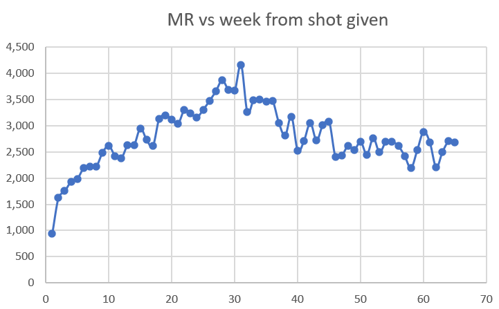
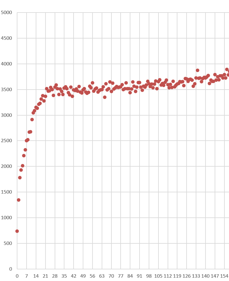
New Zealand COVID vaccine: not a flat line!
From my “In-depth analysis” article on the New Zealand data.
This is shot 4 data from New Zealand. You can see the HVE ends in 21 days.
This is dose 1. People moved out of Dose 1 and into the Dose 2 bucket. So because the cohort was changing, it’s hard to tell what is going on. This time series basically put people in ONLY the bucket they were currently in, rather than simply show all deaths after the first shot.
This is shot #2. The mortality rate goes from 1,500 to nearly 2,500 in just 7 weeks after the shot. This is at a time when seasonality is driving deaths down.
Here is dose 3 given when seasonality is in an uptrend. Now it REALLY takes off!
So we have mortality rising after the shot, when the background is a downtrend or uptrend.
The only way that can happen is an unsafe vaccine.
There is no other explanation that fits.
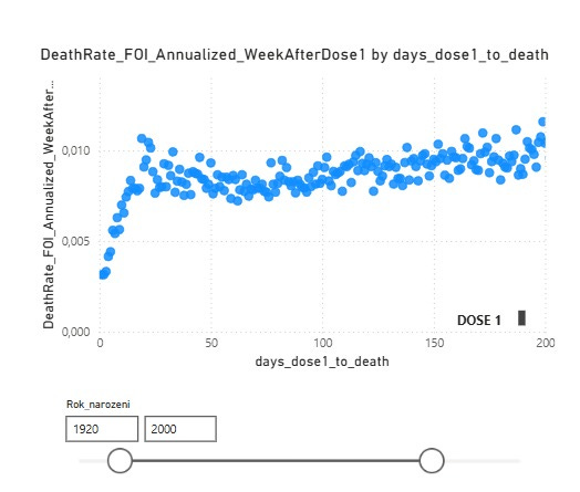
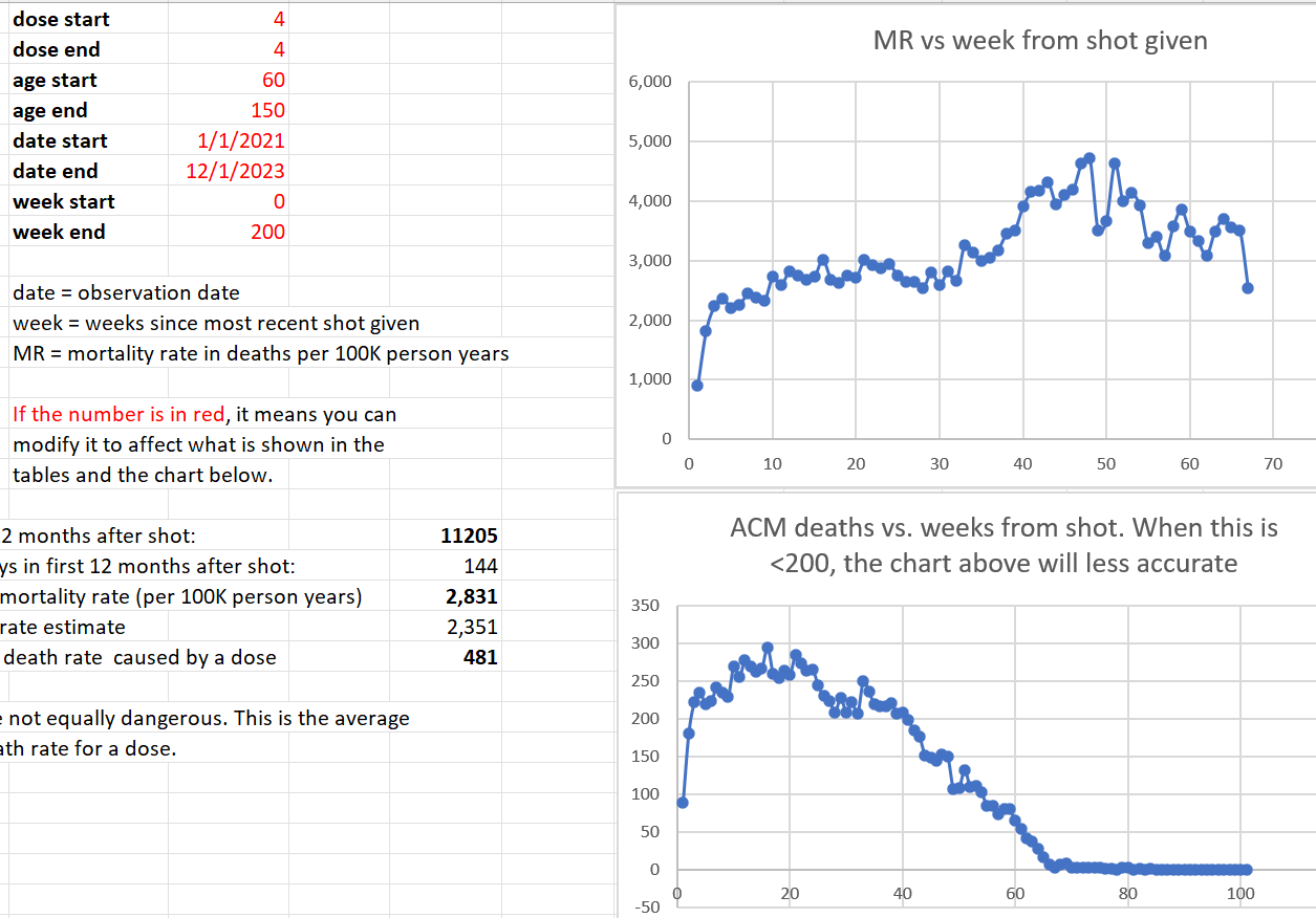
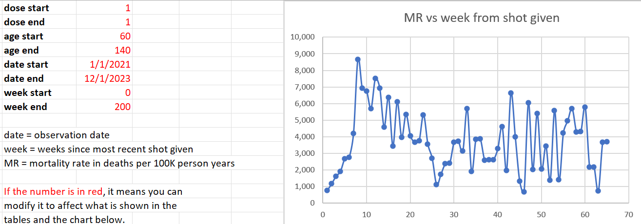
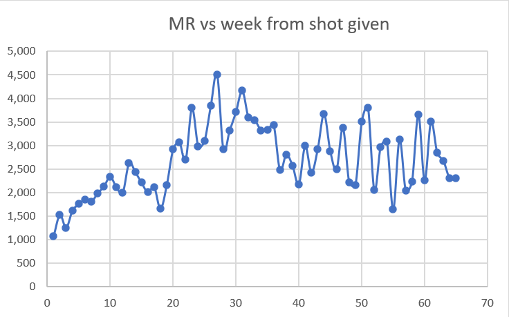
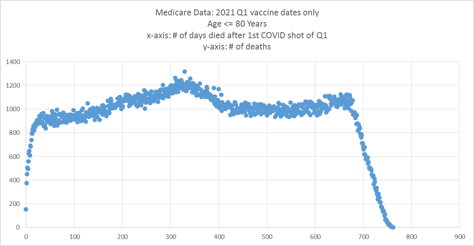
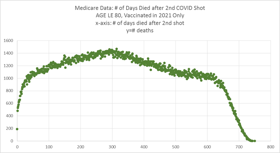
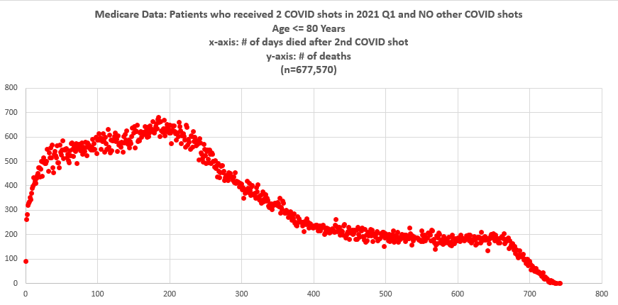
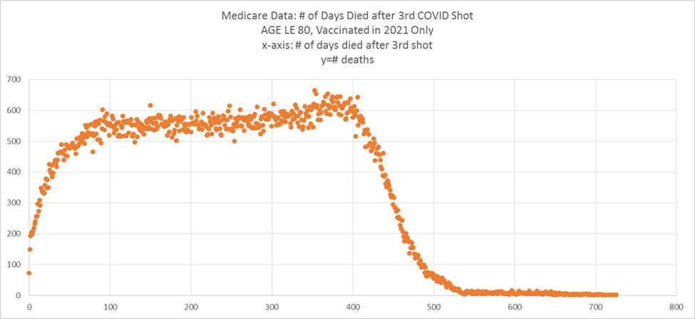
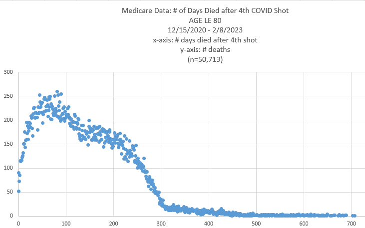
United States Medicare COVID vaccine: not a flat line!
See this article for details.
Shot #1 given at different times.
The first plot makes it easy to count the dots. After 21 days, HVE is over.
So COVID or no COVID, HVE lasts the same amount of time.
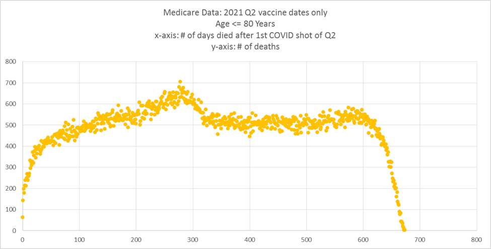
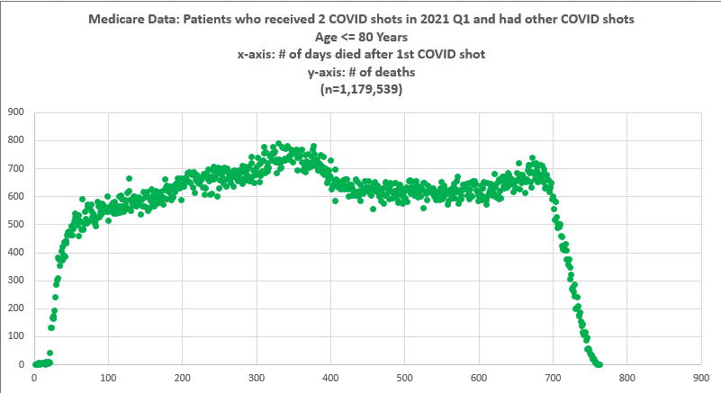
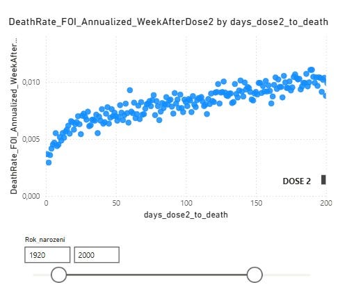
Shot #2
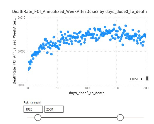
Shot #3
Shot #4… they run out of time to die in the database I had access to.
Summary
In a safe vaccine, there is a 3 week rise due to HVE and then the deaths per day stabilizes with a mild straight slope based on the average age of the vaccinated cohort.
In an unsafe vaccine, the deaths per day keep rising until levelling off.
It’s so obvious, isn’t it?
The COVID shot time series shows rises in every country because it isn’t a safe vaccine.
But the medical community refuses to admit the obvious.
And I don’t think they ever will. No matter how clear the evidence is.
So I’m just doing my part to document how broken the system is. For the record.